Space managers must often align space use with operational initiatives, such as amount of meeting room space in a usable area, or the percent of space that is assigned to a specific department.
To accommodate those needs, the Allocations and Benchmarks report enables the space manager to see how all space is divided among various attributes such as categories, departments, and occupancy, and compare actual use to benchmarks.
This report supports the following use cases:
The task provides two tabs: Allocations and Benchmarks. For each tab, you specify the options that you want to report on.
Each tab presents filter options so that you can control which data the report uses to generate the bar graph.
X-axis and Y-axis: Choose the data that you want to display on each axis of the bar graph. The options vary between tabs, but you can choose between room area and room count for the one axis, and values such as floor, building, site, room category, for the other axis.
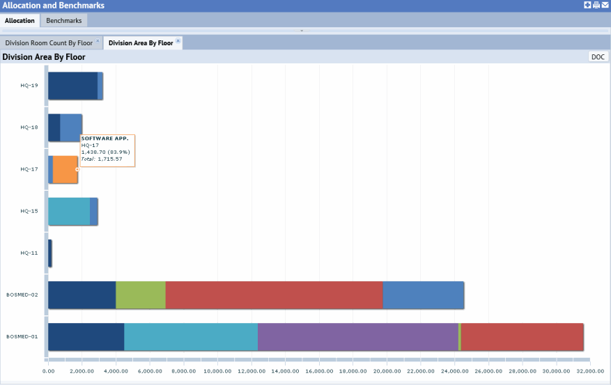
Group By: For the bars in the graph, you can choose the data that the bars will report on. For example, if you report on area (X-axis) for each floor (Y-axis) and if floor HQ-17 is occupied by two divisions, the bar for this floor will be proportionately divided into two sections according to the values for Division; you can then hover over each section in the bar to determine the value and percentage of overall floor area that this section represents. The below image shows this configuration.

The Allocations tab reports on how area is distributed to among various criteria (the value that you specify in the Group By option). By visually examining the length of each bar, you can see how the overall area size varies between floors. Use the colored sections of each bar to determine how area within a floor is allocated to specific departments, divisions, room categories. and so on (depending on the Group By option). Mouse over each color block in the bar to see the value it represents and its percentage of the overall area. Note that if you choose "All Area Types" for Group By, the bar will indicate all types of areas: vertical penetrations, service areas, and departmental areas.
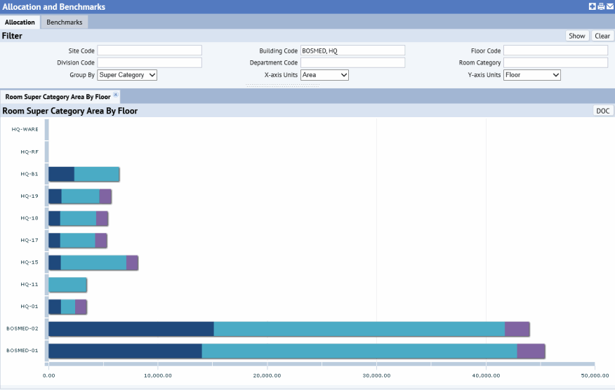
For example, by grouping by Super Category, you can see how each floor is divided among service area (dark blue), vertical penetration (purple), and usable area (light blue).

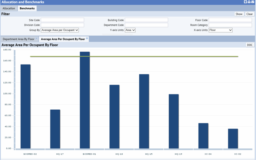
If a benchmark value exists for the selected Group By option , then the view shows that benchmark value as a horizontal line on the bar chart control; for example, the green line in the below image is the benchmark for average area per occupant. Use benchmarks to compare your current conditions with your goal.

Benchmark values are set with the following task:
The benchmarks are:
OccupancyRate: used if the user selects Occupancy Rate for Group ByAverageAreaPerOccupant: used if the user selects Average Area per Occupant for Group ByWith metrics such as area, cost, occupancy, and benchmark area per occupant, organizations may identify and quantify opportunities for cost improvement. Here is an example:
Another way of looking at this is:
In the Group By option, you can choose other values, such as Room Category or Headcount, for which a benchmark has not been established. In these cases, you receive a bar graph showing the data per your filter settings.